PROJECT:
JEFFREY COURT, INC.
REBRAND
An identity who’s new path would
choose to Create an Impression.
CLIENT:
Jeffrey Court, Inc.
CATEGORY:
Brand/Identity
Account Director:
Graphic Artist:
Jeffrey Court was at a crossroads. Their brand lacked a consistent direction; there was no clear marketing vision, and it possessed a detrimental channel conflict. The original logo mark (shown below on left) was shared by both trade and retail divisions. We dove deep to find the heart and soul of Jeffrey Court. For a year we investigated what was needed to: move the brand up-market, make sure the brand held on to nostalgic roots, create a set of core values that employees and customers could rally around, and set the marketing direction for years to come. The results were profound and can be seen on the right
THE BEFORE – SOME KEY ISSUES TO HAMMER OUT:
- In the consumer’s eye there was no clear difference between Jeffrey Court sold in Home Depot at $15.00 a square foot and Jeffrey Court sold in high-end tile showrooms at $40.00; To the consumer “tile was tile.” This lack of differentiation nearly forced the consumer’s hand to choose the cheapest substitute resulting in diluted B2B sales and frustrated dealers and distributors.
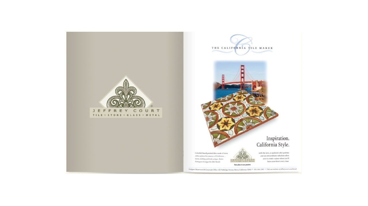
- The brand’s value proposition hinged on the tagline “The California Tile Maker, and in late 2012 Jeffrey Court moved their tile making operations out of the country.
- Although much of the creative work was handled by an award winning agency, it did not evolve. The brand was stuck in a creative funk for nearly ten years. Active marketing was substituted for production work. The direction of the brand was just not in touch with the changing marketplace.
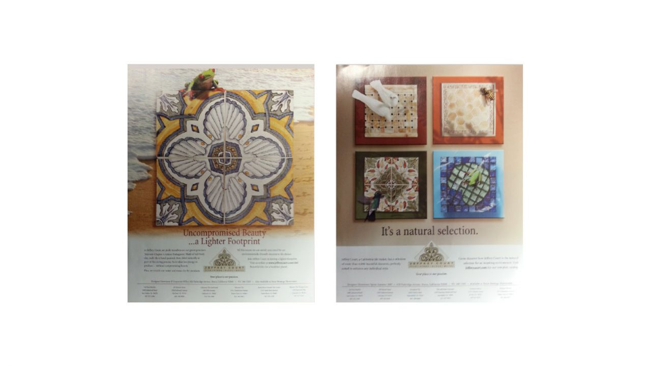
- The brand itself did not clearly convey value, high-end products, or the organization’s core values – “the why” as seen in the artifacts below.
THE AFTER – CREATE AN IMPRESSION
- Channel conflict was resolved by creating brand segmentations. There were now two different brands for Trade/Designer division product lines, and Retail division products found in Home Depot (later refreshed). A value proposition was born, a consumer now entered a showroom, or Home Depot and could know the difference between designer-level, and Do-It-Yourself products.
- The brand now had logos that also served as icons making it easier for a consumer to recall. Brand nostalgia was preserved; the retail division kept the iconic fluer-de-lis because Home Depot was Jeffrey Court’s first retailer.
- The ‘JC’ brand clearly conveys high end. The icon itself was to look higher-end; however, the color scheme was chosen to convey an “I’m home” feeling. All aspects of the brand were meant to go upmarket; from collateral materials to product photography. The Jeffrey Court brand was now positioned as the go-to tile brand to add “panache” within the home, without breaking the bank.